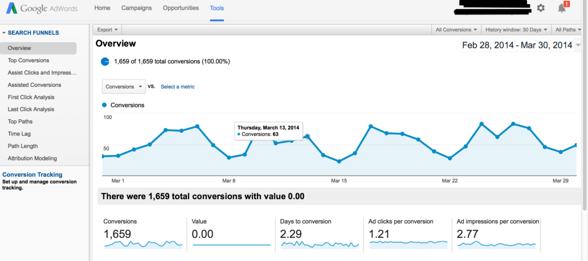
Adwords Updates
Keywords Research
Landing Pages
PPC Account
SE Analysis
SEM
SEM Strategies
SEM Updates
SEO
Thank you Pages
Want To Take Post Conversion To Next Level --- Here Are Some Examples
- Credit goes to
As conversion-oriented marketers, our focus is typically on persuading traffic to take action once people visit our landing pages. The Holy Grail is getting the click (sale, subscription, etc.). And – once that happens – many marketers simply thank the customer and happily walk away with cash in hand.
Big mistake.
Thank you pages are much more than pieces of virtual real estate on which to display gratitude and order numbers. These pages are an integral part of an optimized conversion system that, when used properly, can continue to boost your revenue.
Here are several examples of thank you pages that do an outstanding job of taking post-conversion to the next level.

There’s no better proof that visitors are in conversion mode than when they click the buy button. You’ve earned their trust, explained the benefits of your offer and persuaded customers to action. Don’t lose the momentum with a lax thank you page.
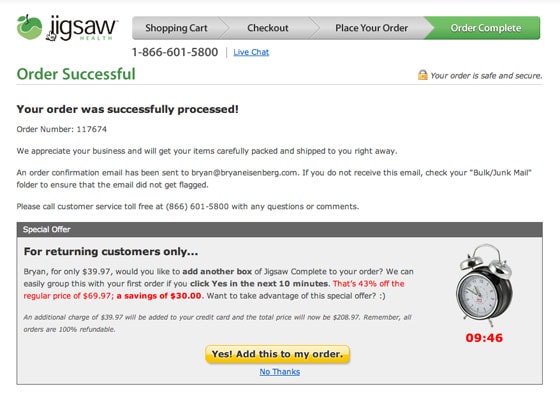
Premium dietary supplement manufacturer Jigsaw Health provides extremely limited-time offers to returning visitors, as shown above.
In addition to the standard handshake and order number, Jigsaw draws out that buying mindset by enticing shoppers with deep, short-lived discounts that are hard to pass up.
The countdown timer (under the clock on the right) compounds the sense of urgency, as the red copy immediately gets the point across that 43% savings are about to slip away. And therein lies the psychological trigger this thank you page is based on: Loss aversion.
As the customer watches the seconds tick past, she feels the pressure mounting: “Is this something I take every month?” “Will the supplement expire before I use it?” “43% is a big discount!” All these questions and thoughts can easily bring the visitor to yet another buying decision.
Because Jigsaw Health’s shopping cart has the ability to simply add the upsell to the existing order, it’s a quick, one-click add-on.

What’s the biggest challenge marketers face when leads sign up for something free? Is it customer support issues? Maybe it’s delivery hurdles?
Nope! The problem comes in actually getting leads to consume the freebie they signed up for.
List management software company AWeber has some simple but effective ways to urge people who have registered for a free webinar to actually attend.
The problem lies in the fact that there is nothing vested in the transaction. Yes, the lead committed (sort of) to attend when they registered. But since most companies offer video recordings these days, that commitment holds little weight. Leads expect to be able to watch the webinar later. Some do, most don’t.
Through a combination of calendar tools and social sharing on their webinar thank you page, those who signed up will be reminded of the event via their own tools (Outlook, etc.) or will have shared a post saying they will attend. That one-two punch reinforces their sense of obligation.

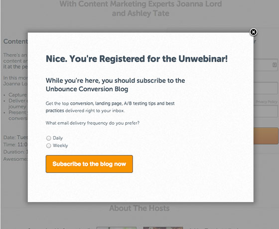
AWeber isn’t the only SaaS company that knows how to rock a webinar thank you page. Unbounce, the landing page builder you know and love, employed a list-building strategy that ramped up their blog subscriber base by 60% in just two (yes, two) webinars
Leads that register for a webinar are already tuned into the content you’re offering. It only makes sense that they would get excited about receiving more top-notch info from you if given the chance. So give them the chance!
Unbounce put this simple subscription option on their webinar thank you page and got huge results. I’ve also been using this list-building method for years. It’s one of the highest-converting tactics I’ve ever tried.

While you might expect a social media pro to incorporate social aspects into his site, Derek Halpern of Social Triggers goes a step beyond asking people to click a share or like button. He encourages those who have downloaded his free ebook to start a mini-community right on his thank you page.
Derek uses his knowledge about social proof to get thousands of mini-testimonials and referrals right on his thank you page by using a simple WordPress plugin. The timing is perfect, as these smiling, happy people have just downloaded a freebie they are excited about.
In addition, this strategy gets huge engagement scores on Facebook and (so far) has enlisted the help of over 1,200 people in spreading the word (and growing Derek’s list!).

Sure, anybody can type the words “thank you” on a web page, but Spanish Pod 101 verbally expresses their gratitude in a video with 29 different languages. In addition, they include a 30% discount on other subscription learning programs.
I have to admit I was intrigued by all the languages and faces in the video, so this unique twist had me engaged. Eventually, I began to scroll as curiosity about the discount kicked in. Talk about a 1-2 punch.
The feature/benefit list and comparison chart help customers quickly choose the program that is right for them. And, of course, trust symbols, such as the 100% guarantee, confirm that this is a risk-free purchase.

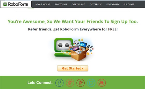
When customers upgrade, it’s a pretty good indication that they are satisfied. RoboForm takes advantage of that state of contentment when users download the latest version of their software.
On its thank you page, the password protection company offers an easy way to share with friends and get a little something for yourself, too.
After all, satisfaction is a good reason to share products and services with others, but getting free stuff is much more compelling! Are you having flashbacks from the holiday season?
Many retailers use this same approach to sell gift cards. How many times have we seen promos that advertise a $10 card for you when you buy two $25 cards for others?
Although the denominations may vary, these offers have proven to work well season after season. Now we see online companies putting that same idea to work every day.

Most marketers who offer free ebooks, white papers or reports leave the heavy lifting to the report itself. Email marketer James Grandstaff does an admirable job of piquing curiosity on his thank you page and driving post-conversions sooner rather than later.
Considering that the majority of leads who download a free report never open it, this is a brilliant move to push hot leads further along in the process faster than usual.
Instead of straight lines and dead ends, think circular when it comes to thank you pages. By providing another touchpoint, you can nudge your customers along the marketing funnel faster than you might think.
As conversion-oriented marketers, our focus is typically on persuading traffic to take action once people visit our landing pages. The Holy Grail is getting the click (sale, subscription, etc.). And – once that happens – many marketers simply thank the customer and happily walk away with cash in hand.
Big mistake.
Thank you pages are much more than pieces of virtual real estate on which to display gratitude and order numbers. These pages are an integral part of an optimized conversion system that, when used properly, can continue to boost your revenue.
Here are several examples of thank you pages that do an outstanding job of taking post-conversion to the next level.
1. Jigsaw Health – Limited Time Offer
There’s no better proof that visitors are in conversion mode than when they click the buy button. You’ve earned their trust, explained the benefits of your offer and persuaded customers to action. Don’t lose the momentum with a lax thank you page.
Premium dietary supplement manufacturer Jigsaw Health provides extremely limited-time offers to returning visitors, as shown above.
In addition to the standard handshake and order number, Jigsaw draws out that buying
mindset by enticing shoppers with deep, short-lived discounts that are hard to pass up.The countdown timer (under the clock on the right) compounds the sense of urgency, as the red copy immediately gets the point across that 43% savings are about to slip away. And therein lies the psychological trigger this thank you page is based on: Loss aversion.
As the customer watches the seconds tick past, she feels the pressure mounting: “Is this something I take every month?” “Will the supplement expire before I use it?” “43% is a big discount!” All these questions and thoughts can easily bring the visitor to yet another buying
decision.Because Jigsaw Health’s shopping cart has the ability to simply add the upsell to the existing order, it’s a quick, one-click add-on.
2. AWeber – Social Sharing

What’s the biggest challenge marketers face when leads sign up for something free? Is it customer support issues? Maybe it’s delivery hurdles?
Nope! The problem comes in actually getting leads to consume the freebie they signed up for.
List management software company AWeber has some simple but effective ways to urge people who have registered for a free webinar to actually attend.
The problem lies in the fact that there is nothing vested in the transaction. Yes, the lead committed (sort of) to attend when they registered. But since most companies offer video recordings these days, that commitment holds little weight. Leads expect to be able to watch the webinar later. Some do, most don’t.
Through a combination of calendar tools and social sharing on their webinar thank you page, those who signed up will be reminded of the event via their own tools (Outlook, etc.) or will have shared a post saying they will attend. That one-two punch reinforces their sense of obligation.
3. Unbounce – Driving Subscriptions
AWeber isn’t the only SaaS company that knows how to rock a webinar thank you page. Unbounce, the landing page builder you know and love, employed a list-building strategy that ramped up their blog subscriber base by 60% in just two (yes, two) webinars
Leads that register for a webinar are already tuned into the content you’re offering. It only makes sense that they would get excited about receiving more top-notch info from you if given the chance. So give them the chance!
Unbounce put this simple subscription option on their webinar thank you page and got huge results. I’ve also been using this list-building method for years. It’s one of the highest-converting tactics I’ve ever tried.
4. Social Triggers – Building Relationships

While you might expect a social media pro to incorporate social aspects into his site, Derek Halpern of Social Triggers goes a step beyond asking people to click a share or like button. He encourages those who have downloaded his free ebook to start a mini-community right on his thank you page.
Derek uses his knowledge about social proof to get thousands of mini-testimonials and referrals right on his thank you page by using a simple WordPress plugin. The timing is perfect, as these smiling, happy people have just downloaded a freebie they are excited about.
In addition, this strategy gets huge engagement scores on Facebook and (so far) has enlisted the help of over 1,200 people in spreading the word (and growing Derek’s list!).
5. Spanish Pod 101 – Facilitating the Upsell
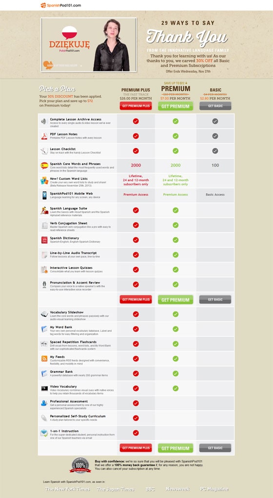
Sure, anybody can type the words “thank you” on a web page, but Spanish Pod 101 verbally expresses their gratitude in a video with 29 different languages. In addition, they include a 30% discount on other subscription learning programs.
I have to admit I was intrigued by all the languages and faces in the video, so this unique twist had me engaged. Eventually, I began to scroll as curiosity about the discount kicked in. Talk about a 1-2 punch.
The feature/benefit list and comparison chart help customers quickly choose the program that is right for them. And, of course, trust symbols, such as the 100% guarantee, confirm that this is a risk-free purchase.
6. RoboForm – Incentivizing Referrals
When customers upgrade, it’s a pretty good indication that they are satisfied. RoboForm takes advantage of that state of contentment when users download the latest version of their software.
On its thank you page, the password protection company offers an easy way to share with friends and get a little something for yourself, too.
After all, satisfaction is a good reason to share products and services with others, but getting free stuff is much more compelling! Are you having flashbacks from the holiday season?
Many retailers use this same approach to sell gift cards. How many times have we seen promos that advertise a $10 card for you when you buy two $25 cards for others?
Although the denominations may vary, these offers have proven to work well season after season. Now we see online companies putting that same idea to work every day.
7. James Grandstaff – Piquing Curiosity
Most marketers who offer free ebooks, white papers or reports leave the heavy lifting to the report itself. Email marketer James Grandstaff does an admirable job of piquing curiosity on his thank you page and driving post-conversions sooner rather than later.
Considering that the majority of leads who download a free report never open it, this is a brilliant move to push hot leads further along in the process faster than usual.
What Shape Are Your Thank You Pages In?
There’s no time like the present. Take a few minutes this week to evaluate your own thank you pages. Check the ones associated with:- Newsletter/Blog subscriptions
- Sales pages
- Free downloads
- Webinar registrations
- Live demo signups
- Ecommerce shopping carts
- Quote requests
- Online banking transactions
Instead of straight lines and dead ends, think circular when it comes to thank you pages. By providing another touchpoint, you can nudge your customers along the marketing funnel faster than you might think.