Latest From My Blog

Showing posts with label PPC Bidding. Show all posts

Want To Understand Your Keyword Performance Better Use Google Search Funnel Reports

- Credit goes to Jeff Baum (original writer) & PPC Hero Original Link


I’ve always taken a bottom line approach to evaluating keyword performance. I want to know how much was spent on clicks, how many conversions those clicks generated, and if my keywords are profitable and performing to client or in-house goals. I base optimizations on these bottom line metrics and decide whether to pause certain keywords.

What I have recently come to understand is that bottom line performance does not tell the entire story.  As users become more sophisticated in their searching patterns, the path from initial search to conversion is growing longer. This conversion path is called a ‘search funnel’.

Understanding an account’s conversion path will help you make more informed optimizations and overall account management decisions. Quite often, your underperforming keywords could be indirectly helping other keywords in the account to convert. Pausing an underperforming keyword that drives conversions in another area of the account will ultimately hurt overall volume and profitability.

Today we will dive into the search funnel report and discuss how to best use it, so you can better understand what comprises the conversion path.

What Is The Search Funnel Report?

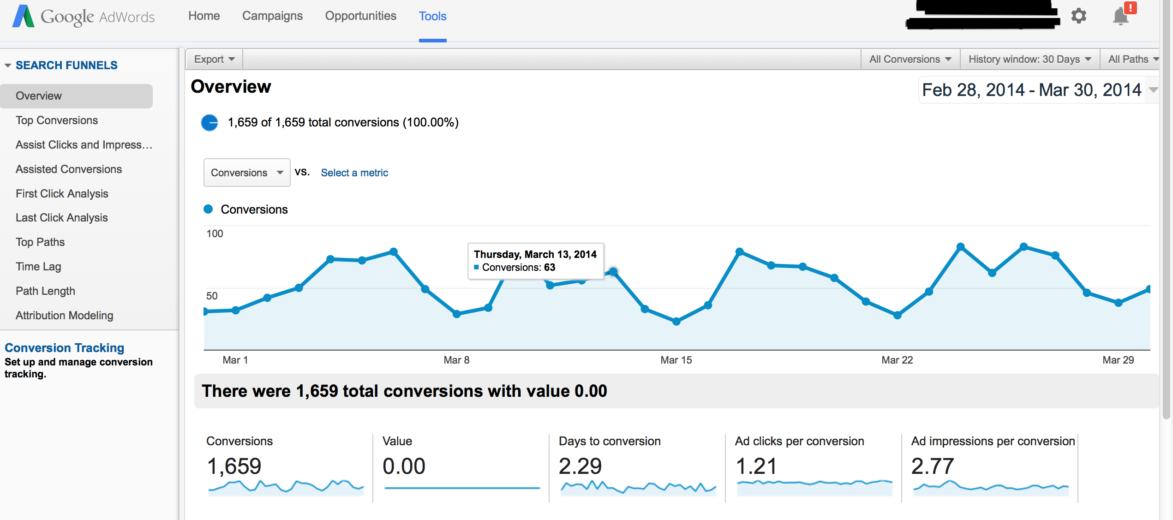
The search funnel report documents a searcher’s entire path to conversion. Sometimes the path is just one query long. Other times it’s an entire series of keywords and queries. Search funnel data can be found in three locations: 1) The Adwords interface, by adding in the assisted clicks, impressions, & conversions columns, 2) By clicking on ‘tools’>conversions>search funnels, and 3) Google Analytics.

Below is an example of a search funnel report.

Search Funnel 1

Interpreting the search funnel report can seem daunting. There are dozens of mini reports and filters that show search funnel activity in a variety of ways. I’ve provided simple definitions to help make it easier to remember what the report’s key fields mean.

Assisted Clicks: Clicks on keywords that led to a conversion on a different keyword.

Assisted Impressions: Impressions that led to other impressions that led to a conversion.

First/Last Click Analysis: Keyword performance at the beginning or end of the conversion path.

Click Assisted Conversions: Total number of conversions a keyword contributed to by having assisted clicks.

Top Paths: The actual path searchers took that led to a conversion.

Path Length: The amount of clicks it took until a conversion occurred.

Attribution Modeling: What marketing channel got credit for the conversion?

Search funnel data is collected via conversion tracking. If conversion tracking is already installed, no additional set up is required. If tracking isn’t installed, all you have to do is create a conversion pixel and install it per Google’s directions. For more information on setting up conversion tracking, just visit Google’s help center.

Now that we have a basic understanding of what the search funnel report, the next question is:

How Should I Use The Data in the Search Funnel Report?

I use search funnel reports to communicate value to my clients, and to better understand user behavior. For instance, when it’s time to decide where to increase or pull back spend, I can justify keeping keywords live that might normally get paused if I were looking exclusively at the bottom line data.

Below is a sample keyword report that I pulled from the Google interface. All I did was add assisted clicks, click assisted conversions, assisted impressions, & impression assisted conversions.

keywords

The cost per converted click for ‘nursing associates program’ is $389. Based on that bottom line cost, I wouldn’t want to continue on with that keyword. However, there is 1 impression assisted click. Whether you value your assisted conversions equally as last click conversions or not, this extra conversion means the keyword is performing much closer to goal and is worth keeping live.

On the other hand, the 2nd keyword, ‘nurse degrees’ has only 1 conversion at a $327 cost per converted click, and it has 0 assisted clicks, conversions, or impressions. In this instance, I can be reasonably assured this keyword is not producing any conversions and is only running up cost, and can therefore be paused.

Below is an example of user behavior. I’m particularly interested in this query path. Notice the progression from a general interest search (‘degree in dental hygiene’), to a more targeted search (‘dental hygienist schools’), and finally to a specific search (‘dental hygienist schools Georgia’).

Screen Shot 2014-03-31 at 4.18.04 PM

From this simple view, I’ve learned 2 things: 1) general keywords are leading to conversions down funnel, and 2) User searches in this path are very deliberate. Each search becomes more refined as the searcher advances through their research process. I also learned I need to fill any keywords gaps by making sure my list contains keywords that mirror the conversion path my prospects are taking.

Want To Implement Psychology of Color to Increase Website Conversions

- Credit goes to Jeremy Smith (original author) & Kismetrics  Original Link

Color wields enormous sway over our attitudes and emotions. When our eyes take in a color, they communicate with a region of the brain known as the hypothalamus, which in turn sends a cascade of signals to the pituitary gland, on to the endocrine system, and then to the thyroid glands. The thyroid glands signal the release of hormones, which cause fluctuation in mood, emotion, and resulting behavior.
Research from QuickSprout indicates that 90% of all product assessments have to do with color. “Color,” writes Neil Patel, is “85% of the reason you purchased a specific product.” It’s a no-brainer fact of any website that color affects conversions. Big time.
So, the bottom line is: use the right colors, and you win.

What is Color Psychology?

In order to really appreciate the tips below, you’ll benefit from a little information on color psychology.
Color psychology is the science of how color affects human behavior. Color psychology actually is a branch of the broader field of behavioral psychology. Suffice it to say that it’s a pretty complicated field. Some skeptics are even dismissive of the whole field of color psychology, due to the difficulty of testing theories. My own research on the topic, as this article conveys, lacks scientific evidence to back up every claim. But that alone is no reason to dismiss the profound and unarguable effect that color has on people.
There are key facts of color theory that are indisputable. In a peer reviewed journal article, Satyendra Singh determined that it takes a mere 90 seconds for a customer to form an opinion about a product. And, 62-90% of that interaction is determined by the color of the product alone.
Color psychology is a must-study field for leaders, office managers, architects, gardeners, chefs, product designers, packaging designers, store owners, and even expectant parents painting the nursery for the new arrival! Color is critical. Our success depends upon how we use color.

Where Should You Use Color?

Let’s get oriented to our context. Since color is ubiquitous, we need to understand where you should use these color tips. This article discusses the use of color in website design. Specifically, we’re talking about the color scheme of a website, which includes the tint of hero graphics, headline type, borders, backgrounds, buttons, and popups.
In the example below, NinjaJump uses a green-yellow-red color scheme in their logo, phone number, video C2A, menu bar, graphics, category menu, sub headings, and sidebar. The tips that we discuss below can be applied in similar ways — menus, sidebars, color schemes, etc.

Using the Right Color in the Right Way

Color is a tricky thing. You have to use it in the right way, at the right time, with the right audience, and for the right purpose.
For example, if you are selling bouncy jump houses — those things that kids play in — you don’t want to use a black website. Props, NinjaJump.com.
1-ninja-jump
For the jump house site, you want lots of bright and vibrant colors, probably some reds, greens, and maybe a splash of yellow for good measure. If, on the other hand, you’re selling a product to women, you don’t want to use brown or orange. Maybe that’s why L’oreal uses black and white, with purple overlay, in their e-commerce homepage.
2-loreal
I’ll explain all the tricks below. In order to succeed at using the right color psychology, you need to follow these core principles:
The right way
The right time
The right audience
The right purpose
Here are some tips that the pros use when dealing with conversions and color.

Color Tips that Will Improve Your Conversions

1. Women don’t like gray, orange, and brown. They like blue, purple, and green.

The sociological differences between color preferences is a whole branch of study unto itself. Patel got it right when he cited the colors preferred, and disliked, by the two genders.
3-color-targeting-demographics
In a survey on color and gender, 35% of women said blue was their favorite color, followed by purple (23%) and green (14%). 33% of women confessed that orange was their least favorite color, followed by brown (33%) and gray (17%).
Other studies have corroborated these findings, revealing a female aversion to earthy tones, and a preference for primary colors with tints. Look at how this is played out. Visit nearly any e-commerce site whose target audience is female, and you’ll find these female color preferences affirmed.
Milani Cosmetics has a primarily female customer base. Thus, there’s not a shred of orange, gray, or brown on the homepage:
4-milani-website
Woman’s Day uses all three of the favorite colors of women (blue, purple, and green) on their homepage, thus inviting in their target audience:
5-womans-day-website
Most people think that the universally-loved female color is pink. It’s not. Just a small percentage of women choose pink as their favorite color. Thus, while pink may suggest femininity in color psychology, this doesn’t mean that pink is appealing to all women, or even most women. Use colors other than pink — like blue, purple, and green — and you may improve the appeal of your e-commerce website to female visitors. And that may, in turn, improve conversions.

2. Men don’t like purple, orange, and brown. Men like blue, green, and black.

If you’re marketing to men, these are the colors to stay away from: purple, orange, and brown. Instead, use blue, green, and black. These colors — blue, green, and black — are traditionally associated with maleness. However, it comes as a slight surprise to some that brown isn’t a favorite pick.

3. Use blue in order to cultivate user’s trust.

Blue is one of the most-used colors, with good reason. A lot of people like blue.
Read the literature on blue, and you’ll come across messages like
  • The color blue is a color of trust, peace, order, and loyalty. (source)
  • Blue is the color of corporate America and it says, “Chill . . . believe and trust me . . . have confidence in what I am saying!” (source)
  • Blue calls to mind feelings of calmness and serenity. It often is described as peaceful, tranquil, secure, and orderly. (source)
There is wide agreement in the research community on the psychological effects of the color blue. Its subtle message of trustworthiness and serenity is true. You can use this to your advantage on your website and landing pages.
The world’s biggest social network is blue. For a company whose core values are transparency and trust, this probably is not an accident.
6-facebook-homepage
A company that serves as a conduit for billions of dollars, PayPal, also prefers the color blue. Chances are, this helps to improve their trustworthiness. If they were to try, say, red or orange as the theme color and branding, they probably wouldn’t have the same level of conversion.
7-paypal-website
Blue is, in fact, a color heavily used by many banks. Here’s CapitalOne.com, a major Internet bank:
8-capital-one-website
Although blue is pretty much an all-round great color, it should never be used for anything related to food. Dieters have used blue plates to successfully prevent them from eating more. Evolutionary theory suggests that blue is a color associated with poison. There aren’t very many blue foods — blueberries and plums just about cover it. Thus, never use blue if you’re selling foodie stuff.

4. Yellow is for warnings.

Yellow is a color of warning. Hence, the color yellow is used for warning signs, traffic signals, and wet floor signs.
9-two-way-sign
10-caution-wet-floor
It seems odd, then, that some color psychologists declare yellow to be the color of happiness. Business Insider reports that “brands use yellow to show that they’re fun and friendly.” There is a chance that yellow can suggest playfulness. However, since yellow stimulates the brain’s excitement center, the playfulness feeling may be simply a state of heightened emotion and response, not exactly sheer joy.
Color psychology is closely tied to memories and experiences. So, if someone had a very pleasant experience with someone wearing a yellow shirt, eating at a fast food establishment with yellow arches, or living in a home with yellow walls, then the yellow color may cause joy by memory association.
One of the most-cited “facts” about the color yellow is that it makes babies cry and people angry. To date, I have not found any study that backs up this claim, even though everyone is fairly comfortable repeating it.
11-google-serp
I’ve even read that “the color yellow can cause nausea,” though I’m doubtful about this.
12-yellow-causes-nausea
If you find the study about cranky babies and angry people living in yellow-walled houses, please let me know. I’m pretty sure that babies are going to cry and people are going to get ticked, regardless of the paint color. Whatever the case, it does seem true that “yellow activates the anxiety center of the brain,” as reported by one color expert.
A heightened anxiety level during any website experience is never a good thing, unless it comes in small doses. Thus, a yellow call to action may create just a touch of anxiety that’s needed to make them click the desired call to action.
Use yellow in small doses unless you want to cause unnecessary anxiety.

5. Green is ideal for environmental and outdoor products.

Perhaps the most intuitive color connection is green — the color of outdoors, eco-friendly, nature, and the environment. Green essentially is a chromatic symbol for nature itself.
Apart from its fairly obvious outdoorsy suggestiveness, green also is a color that can improve creativity. Labeled “the green effect,” one study indicated that participants had more bursts of creativity when presented with a flash of green color as opposed to any other color.
If the focus of your website has anything to do with nature, environment, organic, or outdoors, green should be your color of choice.
Green isn’t just about nature, though. Green also is a good call to action color, especially when used in combination with the “isolation effect,” also known as the von Restorff effect, which states that you remember things better if they stand out. You remember the Statue of Liberty because it’s big, tall, green, and there aren’t a whole lot of them in the New York harbor. In color psychology, the isolation effect occurs when a focus item, such as a conversion step, is the only item of a particular color. The technique works wonders for calls to action, and green is an ideal choice.
Here’s how Conrad Feagin uses it:
13-discover-how
All of Dell’s conversion elements are green.
14-dell-pricing-page
15-dell-inspiron
The word “green” itself is a buzzword for environmental awareness and appreciation. Using the word and the color itself can lend an environmental aura to your website, improving your reputation among those who are passionate about environmental concerns.

5. Orange is a fun color that can create a sense of haste or impulse.

The positive side of orange is that it can be used as the “fun” color. According to some, orange helps to “stimulate physical activity, competition, and confidence.” This may be why orange is used heavily by sports teams and children’s products.
This logo should be familiar, in light of recent events:
Click here to see the logo
Here’s another team that proudly uses orange:
Click here to see the logo
In fact, there are a ton of sports teams that use orange: Florida Gators, Clemson Tigers, Boise State Broncos, Syracuse, New York Knicks, New York Mets, San Diego Chargers, etc.
Amazon.com uses orange in their “limited time offer” banner. The color suggests urgency, which makes the message more noticeable and actionable:
18-amazon-kindle
It makes sense. Orange means active. Orange means fun. Orange means togetherness. Because it’s a loud and warm color. However, orange can be slightly overwhelming. An article on Psych.Answers.com advises, “Orange will be used sparingly to bring your attention to something, but not so much as to overwhelm the actual message of the advert.”
Sometimes, orange is interpreted as “cheap.” (Compare this to black, which is the color of luxury. See below.) Forbes posed the question, “Does orange mean cheap?” in an article on the “Effect of Color on Sales of Commercial Products.” The resounding answer was “yes.” If your product offering is cheap, or if you want it to be seen as such, orange may be a good choice. Vive la Big Lots.

6. Black adds a sense of luxury and value.

The darker the tone, the more lux it is, says our internal color psychology. An article from Lifescript describes black as “elegance, sophistication, power,” which is exactly what luxury designers and high-end e-commerce sites want you to feel. The article goes on to describe black as the color of “timeless, classic” which helps further explain the use of black in high-value products.
In a Business Insider piece on color and branding, the author relates the significance of black:
“Black can also be seen as a luxurious color. ‘Black, when used correctly can communicate glamour, sophistication, exclusivity.’”
Louis Vuitton handbags are not cheap. Absent from the site are colors and designs of whimsy and fun. This is serious value:
19-louis-vuitton
Citizen Watch, better than the average Timex, also uses the dark-tone website design:
20-citizen-eco-drive
Lamborghini does the same thing. Black is the name of the game:
21-lamborghini
If you are selling high-value luxury consumer items on your website, black probably would be a good choice.

7. Use bright primary colors for your call to action.

In strict testing environments, the highest-converting colors for calls to action are bright primary and secondary colors – red, green, orange, yellow.
Darker colors like black, dark gray, brown, or purple have very low conversion rates. Brighter ones have higher conversion rates.
Women’s Health uses a bright mauve-tinted shade for their popup call to action. They’ve got the female-associated purple/pink tint going for them, along with a bright tone.
22-bikini-body
GreenGeeks uses a yellow button:
23-start-selling-today
The biggest retailer in the world uses that famous “add to cart” button. It’s yellow:
24-amazon-qty
Some of the best conversion colors are the “ugly” ones — orange and yellow. An article on ColorMatters.com states, “Psychologically, the ‘anti-aesthetic’ colors may well capture more attention than those on the aesthetically-correct list.” Since the goal of a conversion element is to capture attention, then you may do just fine with that big orange button (BOB). Or yellow.

8. Don’t neglect white.

In most of the color psychology material I read, there is a forgotten feature. Maybe that’s because color theorists can’t agree on whether white is a color or not. I don’t really care whether it is or not. What I do know is that copious use of white space is a powerful design feature. Take, for example, the most popular website in the world. It’s basically all white:
25-google
White is often forgotten, because its primary use is as a background color. Most well-designed websites today use plenty of white space in order to create a sense of freedom, spaciousness, and breathability.

Conclusion

The Internet is a colorful place, and there is a lot that can be accomplished by using color in the right way, at the right time, with the right audience, and for the right purpose.
Naturally, this article leads to questions about making changes in your company’s context. What about if your company has a specific color style guide? What if the logo color dictates a certain tint? What if the lead designer dictates color requirements? How do you deal with that?
You may not be in a position to rewrite your style guide and pick your own website color palette or font colors on the email template. So, how can you use color psychology in these situations? There are a few options:
  • If the colors really suck, campaign for change. In some situations, you may need to make a difference. If you’re a high-heel designer selling to upscale women, but have a crappy orange logo, share your concerns with the decision-makers. People sometimes make stupid color decisions. Kindly show them why and how a killer color scheme can make a conversion difference.
  • Use psychology-appropriate colors that match the existing color scheme. Sure, you need to adapt to the color scheme, but you can still use a splash of strategic color here and there. Let’s say, for sake of example, that you have a blue-themed website. Fine. You can create a popup to harvest email addresses, and use a bright yellow button. The button is psychology-appropriate, and it doesn’t do damage to the company’s color branding.
The more freedom you have in your color scheme, the better. Here are some solid takeaways as you implement color psychology into your website:
  • Test several colors. Despite what some may say, there is no right color for a conversion text or button. Try a green, purple, or yellow button. Explore the advantages of a black background scheme vs. a white background. Find out which works best for your audience and with your product.
  • Don’t just leave color choice up to your designer. I have enormous respect for most web designers. I’ve worked with many of them. However, don’t let your designer dictate what colors you should use on your website. Color is a conversion issue, not just an “Oh, it looks good” issue. Color aesthetics is not everything. Color conversion effects are important! You should be heavily involved in the color selection of your landing pages in order to improve your conversions.
  • Avoid color overload. I’ve just spent over 3,000 words telling you how important and awesome color is. Now, you’re going to go out and color something. But don’t go overboard. Remember my final point. I put it last for a reason. White is a color, and it should be your BFF color, too. Reign in your color enthusiasm with a whole lot of white. Too many colors can create a sense of confusion.

Are You Facing Zero AdWords Conversions Problem

- Credit goes to Iain Dooley (original author) & unbounce  Original Link


It’s exciting when you first start buying AdWords traffic.
You have your offer, you have your landing page up, you’re gonna make it after all!
But that excitement quickly turns to dismay when you find that no one is buying your stuff. Nobody’s signing up.
And every day AdWords keeps taking your money.
At this point many people simply give up on AdWords.
“AdWords just doesn’t work for my business!”
“Maybe we’ll try Facebook ads!”
“We’ll do better with SEO and content marketing!”
The sad truth is that there are very few businesses that are likely to succeed in the long term if they can’t get even a few customers through AdWords initially.
That’s a pretty big claim, but read on and you’ll see why I’m confident in making it.

What’s your problem?

The first step in getting more AdWords conversions is figuring out what a conversion even means for your business.
AdWords conversion tracking allows you to see which of your ads and keywords are getting you the best results.
The actual mechanics of setting up conversion tracking are explained pretty well in Google’s own support documentation and on the face of it this seems like a pretty trivial issue.
If you run a SaaS business, you would set up a conversion event to trigger when someone signs up.
If you’re running an eCommerce business you would set up a conversion event to trigger when someone buys from you.
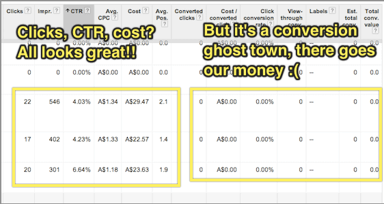
What the Google support documentation (and virtually every other resource on conversion tracking I’ve ever encountered) fails to discuss, though, is what to do when you have zero conversions.
AdWords-conversion-event

Separating out your marketing problem from your sales problem

Chances are that you’re not going to get sales or sign-ups immediately after you start advertising.
This is caused by one of the following 2 issues (or sometimes both):
  1. Keyword targeting: which search terms represent the best opportunities for you to connect with your target market cost effectively?
  2. Conversion: how do we actually sell to our target market?
You can think of these as being a “marketing problem” and a “sales problem” respectively.
If you find that you have a steady stream of affordable traffic from people looking for your product but no one buys, you have a sales problem.
If you find that you can’t afford or can’t find any significant traffic volume from people in your target market, you have a marketing problem.
It’s quite difficult to try and fix both marketing and sales problems simultaneously.
When you’re working on targeting your AdWords spend, especially if your product or service is a bit ambiguous or something quite new, it can be very useful to know which keywords indicate someone as being in your target market even if they haven’t bought from you yet.
For example, say you have a solution for small investors to quickly and easily purchase low-risk diversified company stocks with little research or upfront cash investment. Your target market is certainly online and searching for things related to your solution, but they’re not searching for exactly what it is you’re selling because they don’t know it exists yet.
You have a marketing problem.
Alternatively, say you sell ladies shoes in petite sizes. People are online searching specifically for what it is you’re selling, but they don’t buy from you.
You have a sales problem.
In other words, you want to try and solve your marketing problem independently of your sales problem and this is where using an “intermediary” conversion event in AdWords can help.

Placing the Conversion Event At the Beginning of Your Marketing Funnel

If you sell widgets, and people are looking for widgets, and they come to your site and don’t buy widgets from you, it’s pretty obvious that there’s a problem.
It’s not always immediately apparent, though, whether this is a marketing problem or a sales problem.
The trick here is to fix the marketing problem first by picking just a few of the most promising search terms and focusing on selling to these people.
That way you can hone your sales process while risking very little money on AdWords traffic that doesn’t convert.
But how do you know which search terms are the most promising if no one is actually buying from you?

A good example of this is if you’re running an online shoe store focused on shoes for early childhood up to age 4.
When someone searches for “kids shoes” and comes to your site, but doesn’t buy, was it because your site is poorly optimised and has a hostile user experience (a sales problem), or was it because people searching for kids shoes are mostly looking for shoes for school-aged children over the age of 5 (a marketing problem)?
To find out, you can place a conversion event at the start of your purchase process, rather than the finish. For example, you could trigger a conversion if someone adds any product to their cart.
Another tactic might be to put together a landing page that has a very simple headline/value proposition and a “Learn more” button that goes to your product page.
If you make your headline clear enough, eg. “Healthy shoes for children aged 4 and under” you can be certain that anyone who clicks “learn more” is looking for shoes for their children aged four and under.

Using Google Tag Manager to Track Conversions

In some cases, the task of triggering an “intermediary” conversion event can be technically laborious.
For example, imagine that I wanted to trigger a conversion event if someone went to any page on my site, other than the homepage. Or that I wanted to trigger a conversion when someone clicked “buy now”, triggering a checkout popup window (even if they didn’t complete their purchase).
Google Tag Manager is a tremendously useful tool for tracking complex conversion events in both AdWords and Google Analytics.
Not only can you do traditional “page based” conversions using “rule sets” that trigger your conversions (for example, “trigger this conversion on any page other than the homepage”) but you can attach conversions to virtually any event by using Google Tag Manager Auto Event Tracking.
There’s plenty of good info on how to get started with Google Tag Manager already around the interwebs, so I’ll leave the details of this as an exercise for the reader.

Tracking Multiple Conversion Events Simultaneously

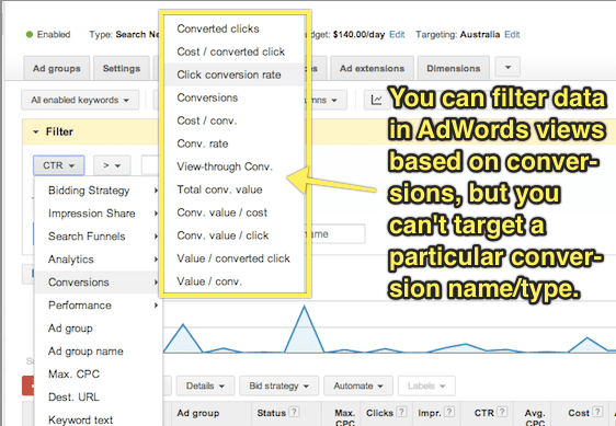
While you can use multiple conversion events and then extract data using AdWords segments to see which keywords are converting according to a particular event, I would highly recommend keeping things simple and just working with one single conversion event at a time.
Using a single conversion event at any given time means you can simply look at your conversion rate in all AdWords screens without having to download a report first and, more importantly, that you can filter your data within AdWords based on conversion rate.
adwords-conversion-event-2
It’s important to remember, though that if you’re working with a single conversion event at a time, that your “conversion rate” will change it’s meaning over time.
That’s to say that if you start off using a “click on any page other than the homepage” event as your conversion event while you target your keywords, then switch to “view of plans/pricing page” while you test your page copy, then switch to tracking “clicks of the signup button”, you will need to record when each of these changes is made so that you look at your conversion rate only within the appropriate timeframe.

Don’t Give Up!

Using PPC landing pages to drive sales for your business is like a super power.
In fact, it’s so powerful that Juan Martitegui from MindValley Hispano made the claim in his Mixergy Interview that “It’s not a business unless you have found a profitable way to buy customers.”
But remember that AdWords isn’t just marketing – it’s also market research. Setting realistic intermediary conversion events allows you to quickly, easily and cheaply validate ideas even before you start selling.
I hope that by applying the principles in this article you’ll be able to use AdWords conversion tracking to incrementally improve each stage of your conversion funnel, and build an unstoppable sales machine for your business or your clients.

Have You Avoided These 3 Landing Page Optimization Mistakes

- Credit goes to Michael Aagaard (original author) & Ubounce  Original Link

Making mistakes and learning from them is an essential part of mastering the art of landing page optimization. I’ve found that out the hard way.
The good news is that there’s no reason you have to make the same mistakes that I did.
In this post, I’ll let you in on 3 basic landing page optimization mistakes that have cost me a lot of conversions. Moreover, I’ll give you simple tips that’ll help you avoid making these mistakes yourself.

1. “Optimizing” With No Clear Conversion Goal In Mind

Knowing what your goals are is essential to achieving success in any realm. Landing page optimization is no exception.
If you want to create a high-converting landing page, you need to start by defining the conversion goal of your landing page. After that, you need to build a landing page treatment that revolves around your conversion goal.
If your goal is to get prospects to fill out a lead gen form, your landing page should be laser-focused on getting them to fill out that particular form. If your goal is to get potential customers to buy a product, your landing page should be laser-focused on getting them to buy that product.

How I used to get it wrong

I used to do this wrong all the time, but there’s one story in particular that comes to mind.
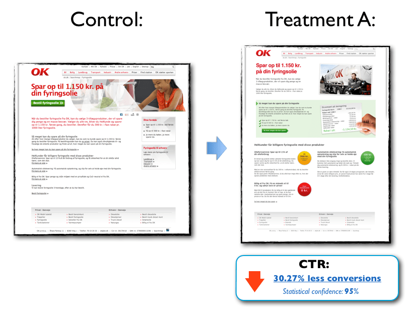
I was working on an LPO project with a designer and the page we were working on was copy-heavy and very boring, so we decided to do a redesign. We were very proud of our work and felt 120% certain that our new landing page would rock – simply because we thought it looked a lot better.
Luckily, we tested the page in the real world. Because as beautiful as it may have been, the landing page treatment actually hurt conversion significantly:
landing-page-mistakes-1
Click image for fill size
The product in this case was heating oil, and our goal was to generate leads for the client. Now, deciding who you are going to buy heating oil from is a big decision for most people and a beautiful landing page is not enough to make more people say yes.
Unfortunately, in all the excitement we forgot about the conversion goal and the target audience and went off on a design trip that resulted in a page that actually scared off more leads than it generated.

A simple way to avoid this mistake

Define a clear conversion goal before you even start thinking about optimizing your landing page and keep it top of mind in every step of the optimization process.
When your design draft is done, go over the individual elements one at a time and ask yourself, “How will this element help prospects make the right decision?”
If the answer is, “Hmm, I’m not sure – but it looks cool!” you may want to consider whether that element should even be on the landing page. As my friend Roger Dooley says:

“If it isn’t motivation, it’s friction.”» Tweet this «

2. Basing Optimization Decisions On Whims and Personal Preferences

In LPO, the quality of your work will ultimately be measured by the impact it has on conversion – not how beautiful it makes the page look or how sexy it makes the copy sound.
If you want to be a successful optimizer, it’s important that the changes you make are informed solutions to real problems – and not just arbitrary guesses.

How I used to get it wrong

I used to base my optimization efforts on whatever felt good or seemed like a great idea in the moment. This approach gave me immediate creative satisfaction but rarely did it result in conversion lifts.
I’ve wasted precious time working on minor design details when there were much more fundamental issues that needed to be resolved. Small creative changes are fun a lot of fun to geek out on, but they rarely have direct impact on conversion if basic things like your headline are off.
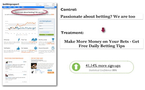
Here’s an example where changing a headline increased sign-ups on a betting forum landing page by 41.14%:
landing-page-optimization-mistakes-2
In this case, the headline treatment did not come about on a whim or because I felt that it sounded awesome. This headline was created based on data on target audience insight. Moreover, the treatment is focused 100% on giving prospects a good and relevant reason to stay on the page and sign up.
Notice that the headline starts with the verb “get” – a particularly powerful word that can work wonders on your messaging. For more on the awesome conversion power of “get” check out this article.
In my experience, ideas for treatments that come about on a whim usually lead to poor results. You can of course get lucky and stumble into something that works, but in the long term it’s really not a winning strategy.

A simple way to avoid this mistake

The more targeted and strategic an A/B test is, the more likely it’ll be to have a positive impact on conversions.
A solid optimization hypothesis goes a long way in keeping you on the right track and ensuring that you’re conducting valuable marketing experiments that will actually have an impact in the mind of the prospect –and, by extension, on conversions.
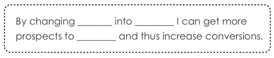
In landing page optimization, the optimization hypothesis is the basic (but data-driven) assumption that you base your optimized variant on. It encapsulates what you want to change on the landing page and what impact you expect to see from making that change. Moreover, it forces you to scrutinize your test ideas and helps you keep your eyes on the goal.
Formulating an optimization hypothesis can be as simple as filling out the blanks in this template:
landing-page-optimization-mistakes-3
Check out this article for a more in-depth guide on how to write a solid hypothesis.

3. Assuming That “One Size Fits All”

Life would be easier if the one-size-fits-all, cookie-cutter approach worked. So much easier.
However, in my experience there is no such thing as a global solution that works every time. All products, offers, landing pages, and companies are different, just like the motivations of your potential customers will be different. You need to find out what works for your specific target audience.

How I used to get it wrong

I used to think that every single case study or blog post I read was directly applicable to any given landing page.
“So a call-to-action above the fold performed best in this LPO case study. Okay, then I should always place my CTA at the top of the page.”
As you can probably imagine, it didn’t take many landing page experiments to find out having the CTA at the top of the page isn’t always the best solution. I’ve tested lots of landing pages where a CTA placed below the fold out-performed a CTA placed above the fold.
But really it’s not a question of above or below the fold – it’s a question of placing the call-to-action where it best complements the decision-making process of your prospects.
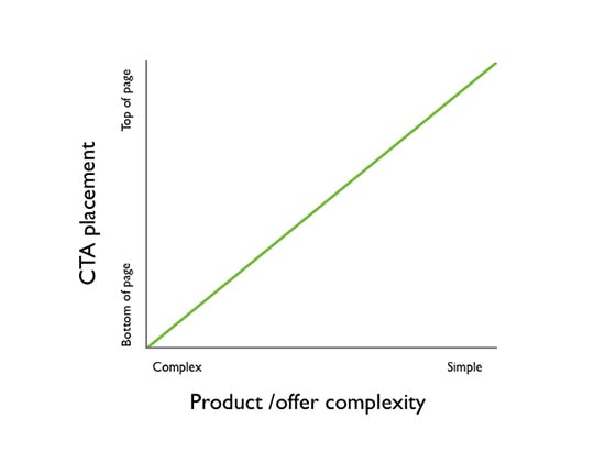
As a general rule of thumb, if the product/offer is complex and the prospect has to digest a lot of information in order to make an informed decision, positioning the CTA lower on the page generally works best.
On the other hand, if the product/offer is very simple and the prospect hardly has to do any thinking in order to make an informed decision, positioning the CTA above the fold generally works best.
But always test, test, test to find out what works best for your campaign.
landing-page-optimization-mistakes-4

A simple way to avoid this mistake:

Learn what you can from other people’s results, but don’t just assume that you can simply replicate those results on your own landing page.
You can get a lot of inspiration and ideas from case studies but before you start implementing things, always take the time to build a solid hypothesis on how this particular test idea will increase conversion on your specific landing page.
In many cases, this simple exercise is enough to keep you from implementing things that are unlikely to work on your landing page and target audience.

The Main Lesson I’ve Learned From All My Mistakes

landing-page-optimizaton-mistaks-5
Your “target audience” on the other side of the screen is made up of flesh and blood. Ultimately, their decisions and actions will determine whether your conversion rate goes up or down.
If you leave your potential customers out of the equation, your optimization efforts will never, ever reach their full potential.
What landing page optimization mistakes have you made and learned from?

Attribution Modeling in AdWords --- from Google

 - Credit goes to PPC Hero Original link

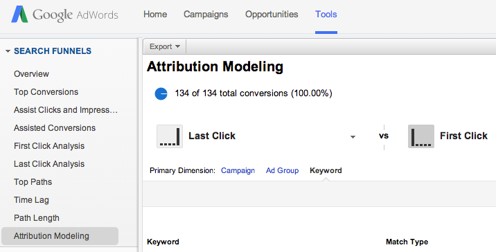
 Google has just released the Search Funnels Attribution Modeling Tool in AdWords. This tool allows you to identify campaigns, ad groups, or keywords that are assisting conversions or are a part of the conversion process. While this tool has been available in Analytics for quite some time, it’s a new feature in AdWords.
Where To Find It
You can find this by navigating to Tools and then Search Funnels. From there you can select Attribution Modeling to compare different models at the campaign, ad group, or keyword level. There are also tabs for Assist Clicks and Impressions, Assisted Conversions, and First and Last Click Analysis.
Attribution Modeling2
As a quick refresher, here is a definition of each model:
  • Last Click: credit goes to the last clicked keyword
  • First Click: credit goes to the first clicked keyword
  • Linear: credit is distributed equally among all clicks on the conversion path
  • Time decay: more credit is given to clicks that happen closer to actual conversion
  • Position-based: 40% credit is given to the first and last clicked keyword, and the remaining 20% is divided among the clicks in-between
Why It’s Helpful
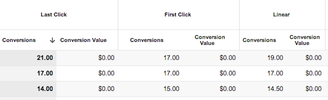
While you could always access this data in analytics, it’s helpful to have it right in AdWords. The First Click attribution model is useful so that you don’t cut out or reduce bids on keywords that are aiding the conversion process but aren’t the last clicked keyword. If you find that users are visiting your page more than once via PPC ads before converting, you might change your ad copy strategy or adjust your bidding strategy.
keyword attribution
Some keywords have a greater impact as a first click or a last click.
AdWords makes it fairly simple to do this with the Model Comparison Tool and the Top Paths feature, which allows you to see all of the converting keywords in order of when they were clicked. I have also found the Query Path (within Top Paths) to be interesting to look at, as it gives you some insight as to how and when customers are searching for your products/services and clicking on your ads.
It is important to note however, that looking at this information in AdWords doesn’t quite give you the whole story. It might be worthwhile to still use Analytics to get a better understanding of all traffic sources coming to your site and how users are interacting with your site. I find that it’s helpful to look at both attribution modeling and top conversion paths in Analytics for both AdWords traffic and all other traffic.
This change isn’t an earth shattering one, but it is nice to see more Analytics features being implemented into the AdWords interface. This kind of information is helpful when making optimizations and getting an overall picture of your account and how your keywords and campaigns are interacting with each other.
What other features from Analytics would you like to see in AdWords?

For Better Attribution Modeling – Do We Use AdWords or Analytics?

- Credit goes to Corina Marcano (original author) & PPCHero.com  Original link

A few days back I read this post about AdWords’ Attribution Modeling being released within the UI. It is a great feature to have in AdWords, but as mentioned in the post, this information does not show us the whole story. In this article I will compare Attribution Modeling in AdWords and Analytics.
What are the main differences in how Attribution Modeling works in AdWords and Analytics?
AdWords Attribution Models allow us to understand how PPC campaigns interact with each other, while Analytics Attribution Models allows us to understand how multi-channels interact with each other during the conversion path.
Putting aside the fact that Analytics is able to show multi-channel interactions while AdWords isn’t, I will limit this analysis to PPC data. There are a few specific models in Analytics that seem interesting to define:
  1. Last AdWords Click: This model attributes 100% of the conversion value to the most recent AdWords ad that the consumer clicked on before converting. So if a consumer clicked once on your ad and then converted from another source of traffic, this type of model will attribute the conversion to the last clicked AdWords campaign.
  2. Last Interaction: This model attributes the conversion to the last touch point from ALL sources of traffic. So if you click on an ad and come back directly a week later and converted, Analytics will not attribute this conversion to AdWords but to direct traffic.
  3. First Interaction: This model attributes the conversion to the first touch point from ALL sources of traffic. So if you click on an ad and come back organically a week later and converted, Analytics will attribute this conversion to AdWords and not to organic traffic.
  4. The Custom Model: The most important model! In this model it is you who decides the rules of attribution. Imagine that you are running branded and generic campaigns. Maybe your client thinks that branded conversions are not as valuable as generic since the consumer was already looking for their brand. This type of model will allow you to assign a specific value to brand conversions compared to generic conversions. You could say that you want each branded conversion to be counted as half of a generic conversion.
On the other hand, AdWords tracks conversions with the model “Last Non-Direct Click”. This model ignores direct visits and attributes 100% of the conversion value to the last channel the consumer clicked on before converting, in this case PPC.
Another important difference is the expiration of each cookie. The default expiration time of AdWords’ cookie is 30 days while the expiration of the Google Analytics campaign cookie (__utmz) is set to 6 months by default.
For example, if you click on an ad and then come back directly from a bookmark, or by directly typing the URL within 30 days, this conversion will be attributed to your PPC campaign and accounted for in AdWords (attributed to the day of the click). This will not be the case if the conversion happens on day 31. However, Analytics will attribute this last conversion to AdWords (CPC) on the date it happened.
If you need to better understand the differences between AdWords and Analytics regarding conversion data, I strongly recommend reading this post.
Let’s look at it with a more specific example
I chose a few campaigns that were paused on December 31st so no additional conversions will be attributed to them in AdWords because of the 30 day window.
1.       For December 2013, this is the information I received from AdWords:
AdWords Attribution Data
As you see on the last line, there is no difference on the total conversions between each model. This is because with Attribution Models within AdWords, you are only able to see how your AdWords campaigns interacted with each other, but you cannot see how they impacted other sources of traffic.
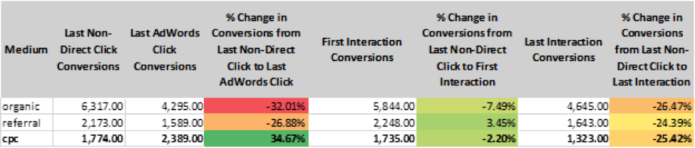
2.       For the same month, this is the information I received from Analytics:
Attribution data from Google Analytics
The information we see in AdWords corresponds to the Model of “Last Non-Direct Click Conversions”. If we look closely at the data for the model “Last AdWords Click Conversion” we realize that CPC contributed to almost 35% more conversions than what it is accounted for in AdWords. Similarly, looking at the “First Interaction Model” and the “Last Interaction Model” we realize that AdWords has been credited for 2.2% more and 25% more conversions respectively when users came back directly to the website or through a bookmark.
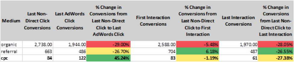
Looking at the same data in Analytics, but for February 2014, I noticed the following:
Google Analytics Attribution Data
CPC is still getting conversions attributed to after the campaigns have been paused and the 30 day window has expired!
PPC, a part of a whole
PPC should not be analyzed by itself. It is a piece, small or big, of a bigger puzzle and these campaigns have a lot more impact on bringing conversions than what we are able to see within AdWords. Analytics allows us to see a greater part of the puzzle and this is exactly the type of information that will definitely help us, digital marketers, to explain to clients the real impact PPC.
As Google evangelist Avinash Kaushik would say, “Optimize for the journey, not for a one night stand”.
So which one do you think is better?
*Note that the differences in Last non-direct click conversions (Analytics Chart) and Conversions (AdWords chart) are due to the 30 days window attribution, the time duration of each cookie, and the date the conversion is accounted for.

Webinar --- Battle for Power in a Marketing Landscape

- Credit goes to PPCHero. Original link

Stretching the marketing dollar can be a daily battle and with the continuous tussle for PPC in particular, you’ve probably had your share of challenging issues and questions. How do you prioritize your marketing dollars? When should you think about moving your marketing budget around? How do you handle “micro-managing” of your PPC accounts? Should you hire an agency for PPC marketing, an in-house staff member, or go the automated path?
In the recording below, digital advertising experts from Hanapin, Searchforce, and Cabela’s talk marketing and contend their daily power struggles from their each unique perspectives, which cover every facet of the industry: an agency, in-house team, and automation software.
You’ll get expert-level PPC tips like:
*How to be a successful gladiator for your PPC accounts
*Insight into the different perspectives of PPC marketing
*How the market landscape can affect your PPC budgeting decisions
*How to tackle “micro-managing” of a PPC budget
Prepare for the ultimate battle of insights, tips, and expert-advice!
Here is the webinar recording:

Webinar Link


And here is the slideshare presentation:

 Slidshare Link

Want To Learn Something From Best & Worst Landing Pages On Web

- Credit goes to Megan Marrs (Original Author) & Word Stream. Original link

Before we get started, it’s important to remember that landing pages aren’t just about the page itself. Process comes into play as well – what did visitors click to be brought to your landing page? If it was an ad, what did the ad say? If it was a newsletter blast, what links did they click? The “landing” process and movement through the funnel is just as important as the physical page design.

In this post, we’re going to evaluate and grade a few landing page examples from each Google search, as well as take a look at some innovative landing page designs that break the mold.

Landing Page Examples Search #1: "Photography Lighting Kit"


The first landing page example comes from Kaezi.
landing page examples 2014
This Kaezi landing page looks great – it’s showing a bunch of studio light kits we might be interested in, and one can click an individual set for more details. There are also some appropriate related categories in the left-hand navigation bar we also might be interested in. Overall the design is clean and we can see the "add to cart" buttons above the fold.
Grade: B+

Next is the photography lighting kit landing page for Cowboy Studio.
Product landing page examples
The first huge problem is intent – I clicked an ad for photography lighting kits, and this is what I get. This isn’t any kind of kit – it’s just one strobe light. As a consumer chances are pretty good that I’d back myself right out of this landing page disaster and find a page that is better at meeting my needs.
The intent is way off, and the design of this page is a mess. There is a lot of wasted space with the social share buttons and enlarge photo/email a friend buttons taking up way too much prime real estate. The info I really want (details on the product) is lost way below the fold. This info should be bulleted and sit right beside the main product image.
landing page info
What’s really frustrating is that this site does have what I’m looking for – they just make it hard to find. A little meandering around the site helped me find some actual photography lighting kits, similar to what Kaezi showed.
wonderful landing page examples
Grade: C-

That was a pretty bad landing page, but it does actually get worse. Hide your kids, hide your wives, things are about to get really ugly with this “photography lighting kit” landing page example from Fovitec.
landing page examples
Immediately upon arriving at this landing page, as a visitor I am completely disoriented. Where the heck am I? I clicked an ad for photography lighting equipment, so why don’t I see anything even remotely photography-oriented? The only hint that I haven’t accidentally clicked a random pop-up ad is the Fovitec logo featuring an aperture icon in the “O” (although whatever camera allusions the word “Fovitec” is supposed to conjure are lost on me).
Even if I stick around long enough (and the vast majority won’t) to explore, none of the navigation links near the top seem to help me with finding lighting kits. Remember: Don't make your visitors search for what you want them to buy! Make it as easy as possible for them to convert.
Grade: F

Landing Page Examples Search #2: "Dog Beds"

Next we’ll try another Google search, this time for “dog beds,” because we all love our dogs and want them to be comfy 'n' cozy.
Orvis does a pretty solid dog bed landing page – their landing page features a wide selection of dog beds, and an eye-catching photo of a happy, napping pup. The large product photos are also appealing, and you can filter the selection by color, feature, shape, fabric, price and more. Since "dog beds" is a pretty broad query, this meets the intent well, allowing the visitor to browse and find exactly what they need. (By contrast, if I'd googled a long-tail query like "large memory foam dog bed," I'd expect the landing page to be more specific.
high converting landing page examples
Grade: A-


Next up is Big Barker Beds, a business selling orthopedic dog beds for larger dog breeds.
ppc landing page examples
This page is a struggle because it does a lot of things right, but the things it does wrong are pretty damaging. The biggest problem with this landing page is its size. It scrolls down for… get this…. 38 pages. Yup, 38 pages, because the text is HUGE. There’s some really awesome content in there, but it’s lost in the sheer quantity of info.
There are a ton of great Amazon reviews featured on the landing page, and while I love how they used the red underline to highlight key points, there are waaay too many reviews (40+). In all fairness, this landing page about XL dog beds does everything in a BIG way – the text, the reviews, everything. You can’t say the page isn’t consistent.
good landing page examples
They have 3 reviews that talk about how easy the bed is to clean, 7 about how the beds are good for arthritic dogs, 5 about how attractive the bed is, etc. It’s absolutely fantastic that so many customers love the product, and it’s really smart to showcase those good reviews, but instead of drowning the visitor is XL print, I’d recommend that there be one shining review about how easy the beds are to clean, one about how they are good for arthritic dogs, etc. Visitors already see that these beds have a five-star Amazon rating (which is a clever trust signal to promote above the fold). If potential buyers want to read more reviews from customers, they’ll go to the Amazon page. Putting every great review on your page only overwhelms web visitors.
While the trust signals up top are great, the first chunk of text below the headline could be a lot more scan-friendly.
landing page best practices
This bulleted text found when you scroll down should really be up above the fold where it can be more useful and provide visitors with a better snapshot about the dog beds.
examples of landing pages
There’s some great info on this page about why this type of bed is recommended for older, arthritic dogs (the info was especially interesting for me as owner of an senior canine) but a lot of this great content gets buried because of the sheer enormity of the page.
Some simple rearrangement of content and text resizing could help this landing page out a lot. (Caveat: I don't know this company's conversion rate, so it's possible that alllll that text below the fold actually helps the page. Stranger results have happened with A/B tests.)
Grade: B

Next up is Pottery Barn. Pottery Barn’s “dog beds” landing page gets a solid fail – clicking their dog bed ad brings me to a landing page for décor accessories. I see pillows, blankets, and slip covers, but nothing dog related.
landing page design examples
What’s really silly is that after searching for dog beds with the site search tool, I find that Pottery Barn does offer dog beds. So why didn’t my landing page look more like this?
example of landing pages
Pottery Barn doubtlessly has a hefty advertising budget, so why such careless work when it comes to landing pages? This is a real missed opportunity on the part of Pottery Barn. The Pottery Barn brand is well known and has a solid following – I’m sure many consumers would choose PB dog beds over others, but driving PPC clicks to the wrong landing page is throwing away potential purchases.
Grade: F

Landing Page Examples Search #3: "Silk Flowers"

Let’s look at what landing page examples we get as we search Google for “silk flowers.”
This landing page starts off with a big flyer talking about all the cool crafts I can make with silk flowers.
product-landing-page-example
That’s cool… I guess. Really I already had an idea in mind and just want to check out the flowers. There they are down below the fold, thrown together in a hodge-podge manner.
examples of landing pages
What’s interesting is that when I do click on that flyer about the DIY crafts I can make with silk flowers, I’m taken to this page.
ppc landing page examples
Hey, it's your most popular silk flowers! This is a much better landing page than the one I was taken to initially. Here we see a wide assortment of silk flowers sorted by name and bright, colorful photos. This is a good landing page – it would have been perfect for my initial search for “silk flowers.” However, in order to get here, I had to click a link talking about DIY silk flowers crafts. I don’t see any craft info here. Sounds like this site really needs to focus on intent and think about where they really want to direct visitors.
Grade: C+
Our next silk flower landing page example comes from eFavorMart.
website landing page examples
This is another unattractive landing page that’s reminiscent of early 2000s. This landing page isn’t doing much with its headings, and the boring, lengthy (and small-print) content is riddled with very obvious cases of keyword stuffing. This page comes off as spammy and damages any potential trust the brand might have earned (and really, any website that starts with a lowercase “e“ or “i” already raises suspicions).
Grade: C

Landing Page Examples Search #4: "Email Marketing Software"

Let’s take a peek into the landing pages we come across in a Google search for “email marketing software.”
Hubspot comes up at the front of the pack, which isn’t a huge surprise. Their landing page lacks any strong imagery to retain the visitor’s attention, choosing instead to focus on its impressive awards and accolades.
great landing page examples
Many other landing pages struggle to rope in and condense their copy, but this Hubspot landing page gets straight to the point. There’s also more convincing copy with social trust signals and customer testimonials below the fold:
good landing page examples
This is a solid landing page example, but could still use some touching up. I’d suggest messing around a bit with the button colors. At the moment the buttons are the same color as the background with a subtle orange outline – not irresistibly clickable. Higher contrast is almost always better. There’s also something lacking with that first above-the-fold page. It’s devoid of any energy or excitement and might benefit from some more color or pop.
Grade: B+
Next up is Zoho Campaigns. Zoho also has a strong landing page design that could benefit from a few adjustments.
B2b landing page examples
Most of my criticisms are small, and may even seem petty, but truly good landing pages do require an almost scientific exactness and perfectionism. The Zoho heading should probably fit on to two lines instead of three. The main image is confusing – is this a glimpse of the product itself, or are we supposed to be drawn to the colorful designed templates Zoho offers against the bleak and dreary templates offered by other companies? It’s not clear – a different image choice could really improve this landing page.
While I like the small icons explaining the core components of Zoho campaigns, the colors are a bit too light. Shades of grey text can be preferred to black, usually used to delineate focus (darker text = more important). These icons should demand more attention, as they tell the key benefits of Zoho. There’s also just a little too much white space present. If I’d have to choose between a landing page that’s too crowded or too spaced out, I’d absolutely choose the spaced out page. However, a second testimonial or an extra icon line of features could be added while still maintaining a sleek, attractive design.
testimonial example
While the customer recommendation is good to have in there, it may be better to choose a recommendation from a more recognizable brand or client (and add their logo to the testimonial). Granted, Cathy of Forum Group Events Ltd. might be their top client, in which case, fine (no offense Cathy, nothing personal).
Grade: B
Next we’re looking at SAP. Boy howdy, this is one hideous hog of a landing page. It looks more like a resources page than a product landing page (and an ugly resources section at that). I clicked an ad that appeared for “email marketing software” and the word “email” is nowhere to be found.
bad landing page examples
It’s a shame because I don’t doubt that some of this is valuable content; it’s great that SAP is trying to create original, helpful content to share with visitors, but this isn’t the time or the place. Some serious visitor intent brainstorming is desperately required here.
Grade: D
Our last landing page example is from Infusionsoft marketing software.
best landing page examples
This landing page is quality stuff.
The headings and text are well chosen and placed, with text color variation to indicate levels of copy importance. The colored icons on the right draw the visitor’s attention to the key benefits offered by the product. The trust indicators in the upper right hand corner are discreet but noticeable. The button color and text are appropriate, and I like how the central-positioned form draws the visitor in.
A few things I would change: I might consider moving the testimonials that exist below the fold up higher and swapping out the bottom left text chunk, but it’s not the end of the world.
top landing page examples
I am irked a tiny bit that the first name form field doesn’t align with the one below, and that the button isn’t perfectly centered between the form fields, but those are easy fixes. I see a free trial offer as a better incentive than a demo, but maybe Infusionsoft has great success with their demo – each company has their own folder of testing research that can influence certain elements of their landing page. Remember, you know your company best, and it’s very possible that not all general landing page best practices will apply to you.
I believe this might be my favorite of all the landing page examples we’ve looked at.
Grade: A+
+