Latest From My Blog

Showing posts with label Ad Rank. Show all posts

For Better Attribution Modeling – Do We Use AdWords or Analytics?

- Credit goes to Corina Marcano (original author) & PPCHero.com  Original link

A few days back I read this post about AdWords’ Attribution Modeling being released within the UI. It is a great feature to have in AdWords, but as mentioned in the post, this information does not show us the whole story. In this article I will compare Attribution Modeling in AdWords and Analytics.
What are the main differences in how Attribution Modeling works in AdWords and Analytics?
AdWords Attribution Models allow us to understand how PPC campaigns interact with each other, while Analytics Attribution Models allows us to understand how multi-channels interact with each other during the conversion path.
Putting aside the fact that Analytics is able to show multi-channel interactions while AdWords isn’t, I will limit this analysis to PPC data. There are a few specific models in Analytics that seem interesting to define:
  1. Last AdWords Click: This model attributes 100% of the conversion value to the most recent AdWords ad that the consumer clicked on before converting. So if a consumer clicked once on your ad and then converted from another source of traffic, this type of model will attribute the conversion to the last clicked AdWords campaign.
  2. Last Interaction: This model attributes the conversion to the last touch point from ALL sources of traffic. So if you click on an ad and come back directly a week later and converted, Analytics will not attribute this conversion to AdWords but to direct traffic.
  3. First Interaction: This model attributes the conversion to the first touch point from ALL sources of traffic. So if you click on an ad and come back organically a week later and converted, Analytics will attribute this conversion to AdWords and not to organic traffic.
  4. The Custom Model: The most important model! In this model it is you who decides the rules of attribution. Imagine that you are running branded and generic campaigns. Maybe your client thinks that branded conversions are not as valuable as generic since the consumer was already looking for their brand. This type of model will allow you to assign a specific value to brand conversions compared to generic conversions. You could say that you want each branded conversion to be counted as half of a generic conversion.
On the other hand, AdWords tracks conversions with the model “Last Non-Direct Click”. This model ignores direct visits and attributes 100% of the conversion value to the last channel the consumer clicked on before converting, in this case PPC.
Another important difference is the expiration of each cookie. The default expiration time of AdWords’ cookie is 30 days while the expiration of the Google Analytics campaign cookie (__utmz) is set to 6 months by default.
For example, if you click on an ad and then come back directly from a bookmark, or by directly typing the URL within 30 days, this conversion will be attributed to your PPC campaign and accounted for in AdWords (attributed to the day of the click). This will not be the case if the conversion happens on day 31. However, Analytics will attribute this last conversion to AdWords (CPC) on the date it happened.
If you need to better understand the differences between AdWords and Analytics regarding conversion data, I strongly recommend reading this post.
Let’s look at it with a more specific example
I chose a few campaigns that were paused on December 31st so no additional conversions will be attributed to them in AdWords because of the 30 day window.
1.       For December 2013, this is the information I received from AdWords:
AdWords Attribution Data
As you see on the last line, there is no difference on the total conversions between each model. This is because with Attribution Models within AdWords, you are only able to see how your AdWords campaigns interacted with each other, but you cannot see how they impacted other sources of traffic.
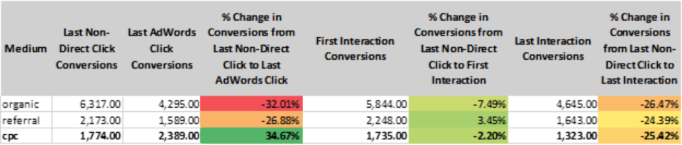
2.       For the same month, this is the information I received from Analytics:
Attribution data from Google Analytics
The information we see in AdWords corresponds to the Model of “Last Non-Direct Click Conversions”. If we look closely at the data for the model “Last AdWords Click Conversion” we realize that CPC contributed to almost 35% more conversions than what it is accounted for in AdWords. Similarly, looking at the “First Interaction Model” and the “Last Interaction Model” we realize that AdWords has been credited for 2.2% more and 25% more conversions respectively when users came back directly to the website or through a bookmark.
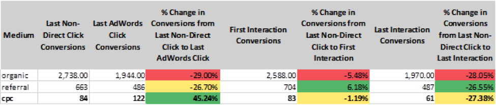
Looking at the same data in Analytics, but for February 2014, I noticed the following:
Google Analytics Attribution Data
CPC is still getting conversions attributed to after the campaigns have been paused and the 30 day window has expired!
PPC, a part of a whole
PPC should not be analyzed by itself. It is a piece, small or big, of a bigger puzzle and these campaigns have a lot more impact on bringing conversions than what we are able to see within AdWords. Analytics allows us to see a greater part of the puzzle and this is exactly the type of information that will definitely help us, digital marketers, to explain to clients the real impact PPC.
As Google evangelist Avinash Kaushik would say, “Optimize for the journey, not for a one night stand”.
So which one do you think is better?
*Note that the differences in Last non-direct click conversions (Analytics Chart) and Conversions (AdWords chart) are due to the 30 days window attribution, the time duration of each cookie, and the date the conversion is accounted for.

Want To Learn Something From Best & Worst Landing Pages On Web

- Credit goes to Megan Marrs (Original Author) & Word Stream. Original link

Before we get started, it’s important to remember that landing pages aren’t just about the page itself. Process comes into play as well – what did visitors click to be brought to your landing page? If it was an ad, what did the ad say? If it was a newsletter blast, what links did they click? The “landing” process and movement through the funnel is just as important as the physical page design.

In this post, we’re going to evaluate and grade a few landing page examples from each Google search, as well as take a look at some innovative landing page designs that break the mold.

Landing Page Examples Search #1: "Photography Lighting Kit"


The first landing page example comes from Kaezi.
landing page examples 2014
This Kaezi landing page looks great – it’s showing a bunch of studio light kits we might be interested in, and one can click an individual set for more details. There are also some appropriate related categories in the left-hand navigation bar we also might be interested in. Overall the design is clean and we can see the "add to cart" buttons above the fold.
Grade: B+

Next is the photography lighting kit landing page for Cowboy Studio.
Product landing page examples
The first huge problem is intent – I clicked an ad for photography lighting kits, and this is what I get. This isn’t any kind of kit – it’s just one strobe light. As a consumer chances are pretty good that I’d back myself right out of this landing page disaster and find a page that is better at meeting my needs.
The intent is way off, and the design of this page is a mess. There is a lot of wasted space with the social share buttons and enlarge photo/email a friend buttons taking up way too much prime real estate. The info I really want (details on the product) is lost way below the fold. This info should be bulleted and sit right beside the main product image.
landing page info
What’s really frustrating is that this site does have what I’m looking for – they just make it hard to find. A little meandering around the site helped me find some actual photography lighting kits, similar to what Kaezi showed.
wonderful landing page examples
Grade: C-

That was a pretty bad landing page, but it does actually get worse. Hide your kids, hide your wives, things are about to get really ugly with this “photography lighting kit” landing page example from Fovitec.
landing page examples
Immediately upon arriving at this landing page, as a visitor I am completely disoriented. Where the heck am I? I clicked an ad for photography lighting equipment, so why don’t I see anything even remotely photography-oriented? The only hint that I haven’t accidentally clicked a random pop-up ad is the Fovitec logo featuring an aperture icon in the “O” (although whatever camera allusions the word “Fovitec” is supposed to conjure are lost on me).
Even if I stick around long enough (and the vast majority won’t) to explore, none of the navigation links near the top seem to help me with finding lighting kits. Remember: Don't make your visitors search for what you want them to buy! Make it as easy as possible for them to convert.
Grade: F

Landing Page Examples Search #2: "Dog Beds"

Next we’ll try another Google search, this time for “dog beds,” because we all love our dogs and want them to be comfy 'n' cozy.
Orvis does a pretty solid dog bed landing page – their landing page features a wide selection of dog beds, and an eye-catching photo of a happy, napping pup. The large product photos are also appealing, and you can filter the selection by color, feature, shape, fabric, price and more. Since "dog beds" is a pretty broad query, this meets the intent well, allowing the visitor to browse and find exactly what they need. (By contrast, if I'd googled a long-tail query like "large memory foam dog bed," I'd expect the landing page to be more specific.
high converting landing page examples
Grade: A-


Next up is Big Barker Beds, a business selling orthopedic dog beds for larger dog breeds.
ppc landing page examples
This page is a struggle because it does a lot of things right, but the things it does wrong are pretty damaging. The biggest problem with this landing page is its size. It scrolls down for… get this…. 38 pages. Yup, 38 pages, because the text is HUGE. There’s some really awesome content in there, but it’s lost in the sheer quantity of info.
There are a ton of great Amazon reviews featured on the landing page, and while I love how they used the red underline to highlight key points, there are waaay too many reviews (40+). In all fairness, this landing page about XL dog beds does everything in a BIG way – the text, the reviews, everything. You can’t say the page isn’t consistent.
good landing page examples
They have 3 reviews that talk about how easy the bed is to clean, 7 about how the beds are good for arthritic dogs, 5 about how attractive the bed is, etc. It’s absolutely fantastic that so many customers love the product, and it’s really smart to showcase those good reviews, but instead of drowning the visitor is XL print, I’d recommend that there be one shining review about how easy the beds are to clean, one about how they are good for arthritic dogs, etc. Visitors already see that these beds have a five-star Amazon rating (which is a clever trust signal to promote above the fold). If potential buyers want to read more reviews from customers, they’ll go to the Amazon page. Putting every great review on your page only overwhelms web visitors.
While the trust signals up top are great, the first chunk of text below the headline could be a lot more scan-friendly.
landing page best practices
This bulleted text found when you scroll down should really be up above the fold where it can be more useful and provide visitors with a better snapshot about the dog beds.
examples of landing pages
There’s some great info on this page about why this type of bed is recommended for older, arthritic dogs (the info was especially interesting for me as owner of an senior canine) but a lot of this great content gets buried because of the sheer enormity of the page.
Some simple rearrangement of content and text resizing could help this landing page out a lot. (Caveat: I don't know this company's conversion rate, so it's possible that alllll that text below the fold actually helps the page. Stranger results have happened with A/B tests.)
Grade: B

Next up is Pottery Barn. Pottery Barn’s “dog beds” landing page gets a solid fail – clicking their dog bed ad brings me to a landing page for décor accessories. I see pillows, blankets, and slip covers, but nothing dog related.
landing page design examples
What’s really silly is that after searching for dog beds with the site search tool, I find that Pottery Barn does offer dog beds. So why didn’t my landing page look more like this?
example of landing pages
Pottery Barn doubtlessly has a hefty advertising budget, so why such careless work when it comes to landing pages? This is a real missed opportunity on the part of Pottery Barn. The Pottery Barn brand is well known and has a solid following – I’m sure many consumers would choose PB dog beds over others, but driving PPC clicks to the wrong landing page is throwing away potential purchases.
Grade: F

Landing Page Examples Search #3: "Silk Flowers"

Let’s look at what landing page examples we get as we search Google for “silk flowers.”
This landing page starts off with a big flyer talking about all the cool crafts I can make with silk flowers.
product-landing-page-example
That’s cool… I guess. Really I already had an idea in mind and just want to check out the flowers. There they are down below the fold, thrown together in a hodge-podge manner.
examples of landing pages
What’s interesting is that when I do click on that flyer about the DIY crafts I can make with silk flowers, I’m taken to this page.
ppc landing page examples
Hey, it's your most popular silk flowers! This is a much better landing page than the one I was taken to initially. Here we see a wide assortment of silk flowers sorted by name and bright, colorful photos. This is a good landing page – it would have been perfect for my initial search for “silk flowers.” However, in order to get here, I had to click a link talking about DIY silk flowers crafts. I don’t see any craft info here. Sounds like this site really needs to focus on intent and think about where they really want to direct visitors.
Grade: C+
Our next silk flower landing page example comes from eFavorMart.
website landing page examples
This is another unattractive landing page that’s reminiscent of early 2000s. This landing page isn’t doing much with its headings, and the boring, lengthy (and small-print) content is riddled with very obvious cases of keyword stuffing. This page comes off as spammy and damages any potential trust the brand might have earned (and really, any website that starts with a lowercase “e“ or “i” already raises suspicions).
Grade: C

Landing Page Examples Search #4: "Email Marketing Software"

Let’s take a peek into the landing pages we come across in a Google search for “email marketing software.”
Hubspot comes up at the front of the pack, which isn’t a huge surprise. Their landing page lacks any strong imagery to retain the visitor’s attention, choosing instead to focus on its impressive awards and accolades.
great landing page examples
Many other landing pages struggle to rope in and condense their copy, but this Hubspot landing page gets straight to the point. There’s also more convincing copy with social trust signals and customer testimonials below the fold:
good landing page examples
This is a solid landing page example, but could still use some touching up. I’d suggest messing around a bit with the button colors. At the moment the buttons are the same color as the background with a subtle orange outline – not irresistibly clickable. Higher contrast is almost always better. There’s also something lacking with that first above-the-fold page. It’s devoid of any energy or excitement and might benefit from some more color or pop.
Grade: B+
Next up is Zoho Campaigns. Zoho also has a strong landing page design that could benefit from a few adjustments.
B2b landing page examples
Most of my criticisms are small, and may even seem petty, but truly good landing pages do require an almost scientific exactness and perfectionism. The Zoho heading should probably fit on to two lines instead of three. The main image is confusing – is this a glimpse of the product itself, or are we supposed to be drawn to the colorful designed templates Zoho offers against the bleak and dreary templates offered by other companies? It’s not clear – a different image choice could really improve this landing page.
While I like the small icons explaining the core components of Zoho campaigns, the colors are a bit too light. Shades of grey text can be preferred to black, usually used to delineate focus (darker text = more important). These icons should demand more attention, as they tell the key benefits of Zoho. There’s also just a little too much white space present. If I’d have to choose between a landing page that’s too crowded or too spaced out, I’d absolutely choose the spaced out page. However, a second testimonial or an extra icon line of features could be added while still maintaining a sleek, attractive design.
testimonial example
While the customer recommendation is good to have in there, it may be better to choose a recommendation from a more recognizable brand or client (and add their logo to the testimonial). Granted, Cathy of Forum Group Events Ltd. might be their top client, in which case, fine (no offense Cathy, nothing personal).
Grade: B
Next we’re looking at SAP. Boy howdy, this is one hideous hog of a landing page. It looks more like a resources page than a product landing page (and an ugly resources section at that). I clicked an ad that appeared for “email marketing software” and the word “email” is nowhere to be found.
bad landing page examples
It’s a shame because I don’t doubt that some of this is valuable content; it’s great that SAP is trying to create original, helpful content to share with visitors, but this isn’t the time or the place. Some serious visitor intent brainstorming is desperately required here.
Grade: D
Our last landing page example is from Infusionsoft marketing software.
best landing page examples
This landing page is quality stuff.
The headings and text are well chosen and placed, with text color variation to indicate levels of copy importance. The colored icons on the right draw the visitor’s attention to the key benefits offered by the product. The trust indicators in the upper right hand corner are discreet but noticeable. The button color and text are appropriate, and I like how the central-positioned form draws the visitor in.
A few things I would change: I might consider moving the testimonials that exist below the fold up higher and swapping out the bottom left text chunk, but it’s not the end of the world.
top landing page examples
I am irked a tiny bit that the first name form field doesn’t align with the one below, and that the button isn’t perfectly centered between the form fields, but those are easy fixes. I see a free trial offer as a better incentive than a demo, but maybe Infusionsoft has great success with their demo – each company has their own folder of testing research that can influence certain elements of their landing page. Remember, you know your company best, and it’s very possible that not all general landing page best practices will apply to you.
I believe this might be my favorite of all the landing page examples we’ve looked at.
Grade: A+

Want To Konw The Relationship of Click-Through Rate & Ad Position

Everyone always asks me, “What’s a good click-through rate?” The standard answer I always hear is 2%. My answer is always, it depends.

If you don’t want your Quality Scores to suffer, you need to think twice about always targeting a 2% CTR. Quality Scores are very dependent on your CTR by Average Position, so it’s worth getting a good understanding of what this means.

So, what does it mean? People will usually click on the top ad of a SERP (search engine results page), because, well, it’s the first thing that they see. Position 1 will always have a high CTR, and CTR will continue to descend naturally in positions 2, 3, 4 and so on. This being the case, Google knows that position 1 and position 4 are not created equal, and therefore does not treat them equally.

Click-Through Rate By Ad Position

Google does not want to give up their prime real estate (position 1) for a 2% CTR when they can triple their revenue with a 6% CTR. Sure, you can bid up and get there, but what will Google do about this? Drop your Quality Score significantly so you are literally paying for it (or reward you with the dreaded “Rarely shown due to Quality Score” message that you may be seeing in your account).

The opposite is true of lower positions. If you’re putting up a 2% CTR in position 8, Google will reward you with a high Quality Score for bringing them clicks and revenue so low on the page. You’ll pay a lot less and may see Quality Scores of 7+.

Grade your click-through rate today!


So, What’s A Good Click-Through Rate?


Here are some good CTR targets, depending on ad position, for some 7+ Quality Scores:
Position 1: 6%+
Position 2: 4-5%
Position 3: 2-3%
Position 4: 1-2%
Position 5 and lower: 1%

Remember, Click-Through Rate isn’t the only thing that affects Quality Score, but it’s one of the largest factors and deserves some serious attention.
+